
|
In this tutorial I will demonstrate how to create a dual Axis bar chart in MS Excel. I will also show a solution to avoid getting overlaps in the bars that belong to the two axes. The dual axis chart is useful in situations when one (or more) fields in the data set contain data that are significantly smaller or larger than the rest of the data set (e.g. percentage values). In these scenarios that particular field would be barely visible in the chart. Consider the data set below for example. 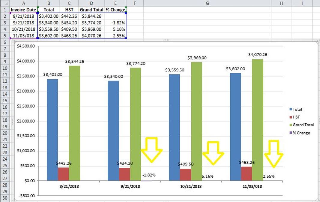 As you could observe the last column of the data set, i.e. “% change” is hard to observe when they are next to the large numbers. Here is the solution STEP 1] go to “Format” and select the particular field that you want to add an extra axis for (in this case “% change”) on the top left hand side of the ribbon. 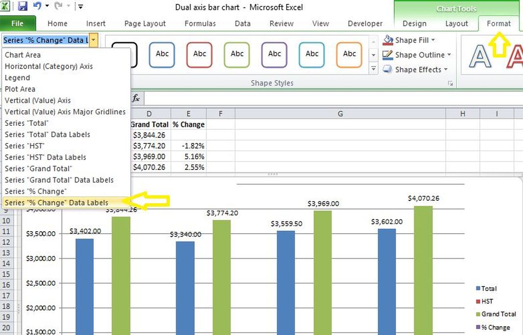 STEP 2] Click on “Format Selection” and the select the “secondary Axis” radio button. 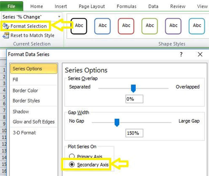 The outcome is demonstrated in the screenshot below. The reason for the overlap is that Excel is treating the extra axis like a line chart where the line is split in the center of the category. The Solution to this anomaly is to create some padding columns so they can overlap only in the Center. 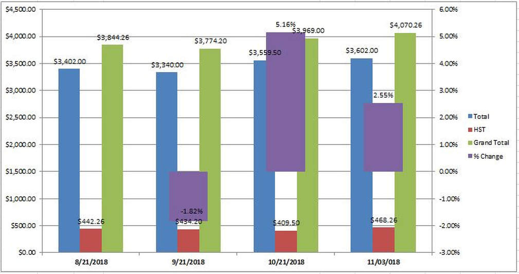 I will create three padding columns (i.e. A, B and C). then reselect the data range for the graph. Here is the final desired view of the bar graph. 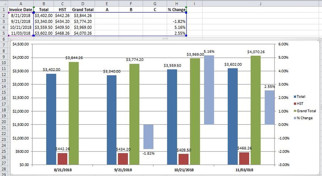 Notes: 1. Manually remove references to the padding columns (i.e. A, B and C) from the legend entries 2. Format the values in the secondary axis as percentages. i.e. right click on the secondary Axis>format axis>Numbers>select “percentage” 3. Right click on the bars and go to “Format data series” in order to fine tune the distance between the bars and also the width of each bar. 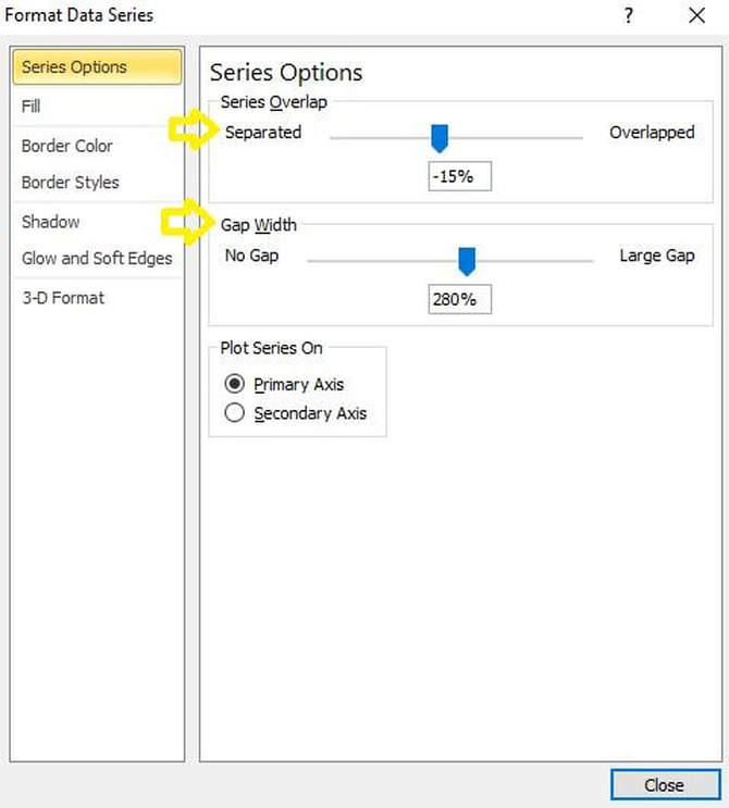
0 Comments
|
