|
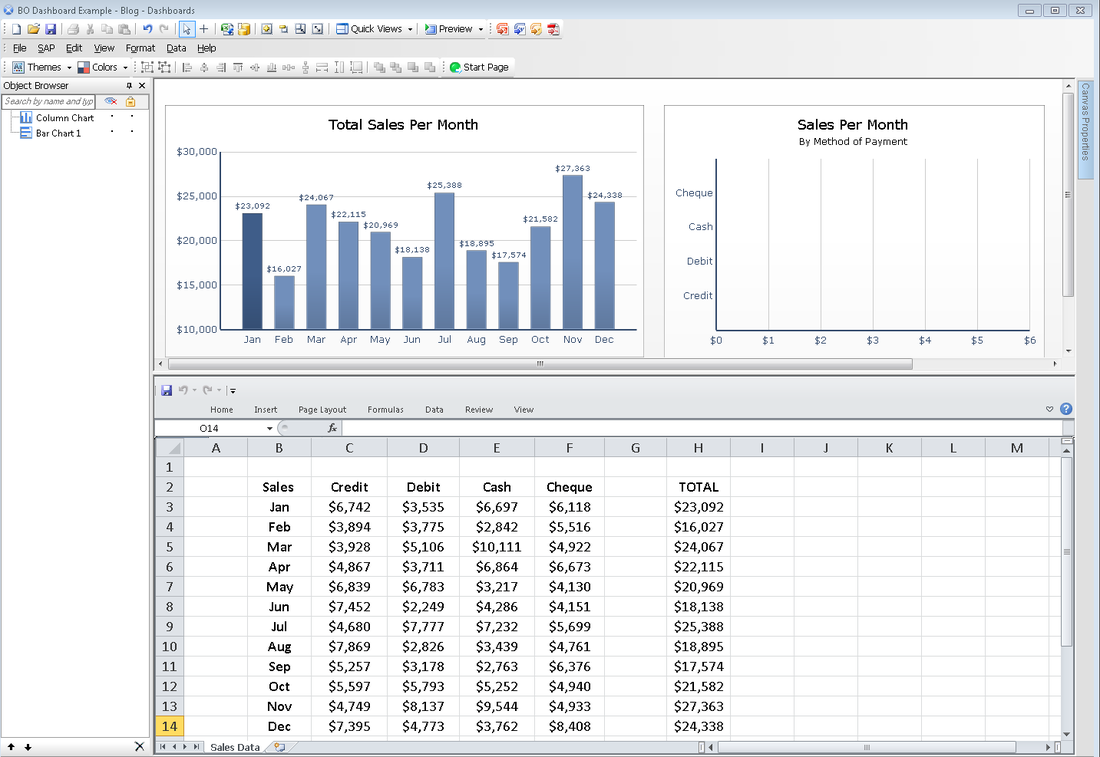
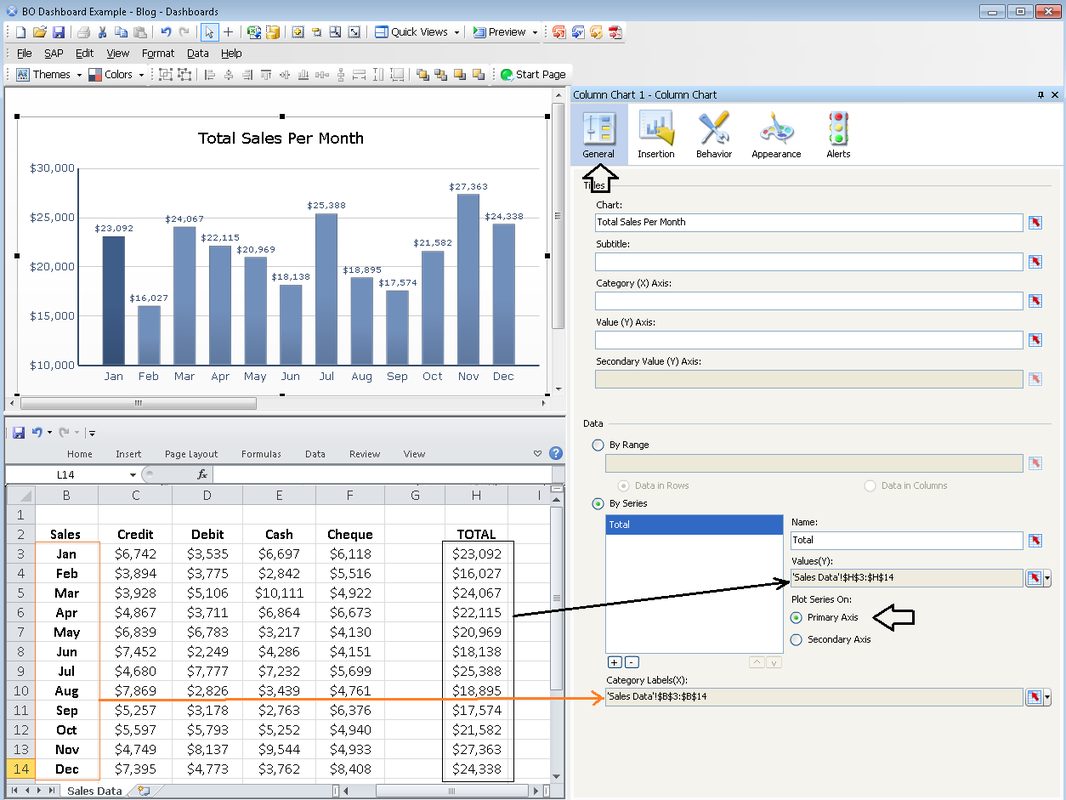
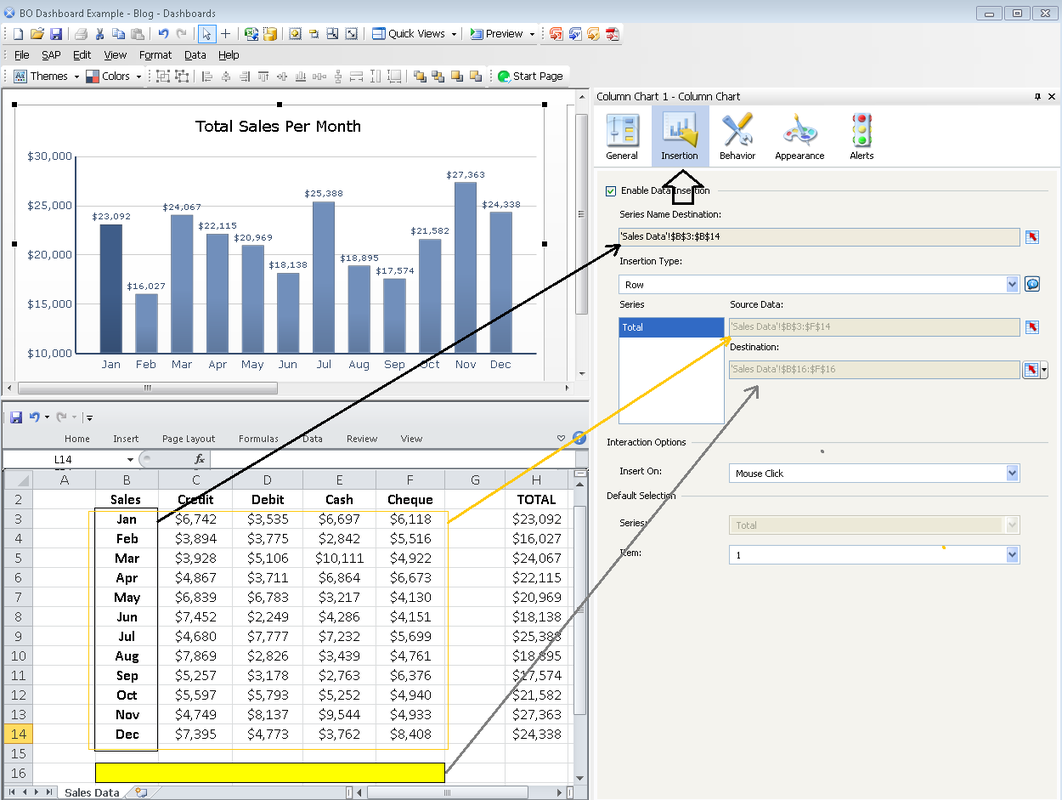
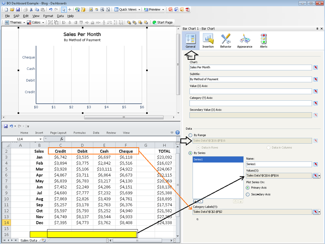
In this blog post, I want to demonstrate how to create a simple interactive dashboard using SAP BusinessObjects DashBoard tool. The objective of this Dashboard is to visualize sales data for a 12 month period and to categorize the payments methods used to receive money from clients (i.e. Credit, Debit, Cash, and Cheque) The dashboard I will build in this example consists of two main components: A "Column Chart" and a "Bar Chart". These two charts must be selected from the Object Browser pane which can be seen on the left hand side of the figure below. The next step is to go the "General" tab in the Properties pane of the Column Chart. I want the column chart to display the total sales for each month. As such, the values chosen for the Y axis in the series will be the range for total monthly sales and the category labels will show the name of the 12 months. See the figure below for more details. The next step is to go to the "Insertion" tab in the properties pane of the Column Chart. Source and Destination of the data must be determined in this step. Note that, the source in this example encompasses data for all four payment methods. and the destination could be any series of epmpty cells. The highlighted cells in the figure below is the destination that I have chosen for the payment types. Also note that it is very imprtant that the insertion type chosen is "Row". This is because the data that goes into the destination will eventually be used by the Bar Chart. In the final step, we must select the Bar Chart and on the "General" tab located on the properties pane, we must input the data by range (Note that the "Data in Rows" radio button must be activated). After entering the Values for the X axis and the categoty labels for the Y axis, Our Dashboard is ready for its intended use. Click the Preview button on the top of the screen and you will arrive at the dashboard. The following illustration is the Dashboard that I created, saved in Flash format. Notice that by clicking on each of the monthly sales columns on the Column Chart, the Bar Chart will visualize the break down for sales based on the payment method for each respective month.
1 Comment
|
CategoriesArchives
June 2020
|


