|
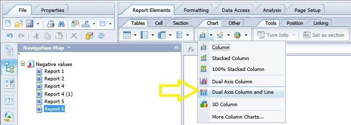
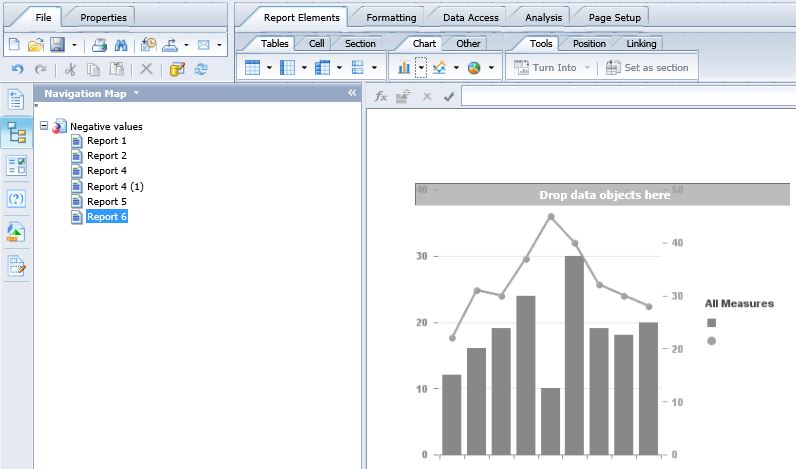
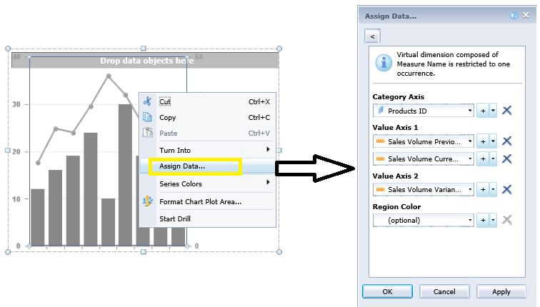
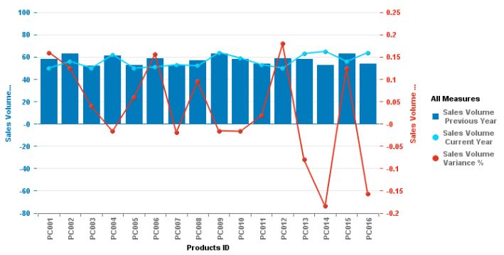
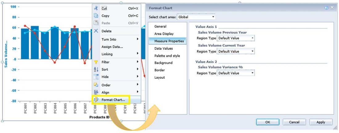
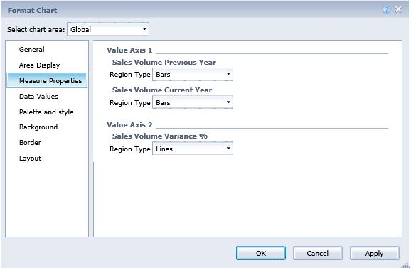
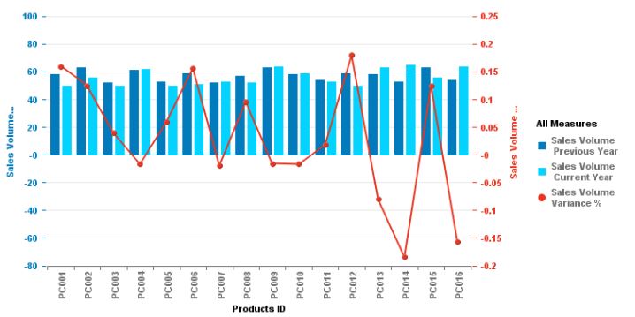
In this post I will demonstrate how to create a dual axis column and line graph in a Webi report within SAP BusinessObjects. STEP 1] Open a Webi report and go to “Design” mode. Under “Report Elements” go to “Chart” and click on “Dual axis Column and Line”. The Following graph will appear: STEP 2] Right click on the graph and go to “Assign Data”. Select the measures which you want in your graph for each of the two axes. In this case I want “sales volume previous Year” and “Sales Volume Current Year” to be the two column elements and the “Sales volume Variance %” to be the line element and “Product ID” as the Category axis. After selecting the measures noted above, click on “Apply” and “OK”. As could be observed in the screenshot below, two of the measures (i.e. “sales volume previous Year” and “Sales Volume Current Year”) have been used as line elements and only one measure (“Sales volume Variance %”) is being displayed as a column element. This is the exact opposite of what I had in mind. After some research, I got to learn how this could be reversed and corrected. STEP 3] Right click on the graph and go to “Format Chart” and then select “Measure Properties” from the left hand panel. As you could see the “Default Value” is automatically selected for the three measures. STEP 4] Modify this and have the two measures on the Value axis 1 be represented as “Bars” and the one measure in the “Value axis 2” be represented as a “Line” as illustrated below: Here is the desired outcome.
0 Comments
Your comment will be posted after it is approved.
Leave a Reply. |
CategoriesArchives
June 2020
|

