
|
The terms Dimension and Measure are constantly used by data experts, particularly those who specialize in data visualization. It also tends to be a very common interview question for BI related roles. In this blog post, I will explain the difference between a dimension and measure using a simple data visualisation example that I have created using Tableau. In Tableau, fields are Broken down to dimensions and measures that represent the column headers of the data (I imported the data to Tableau from MS Excel). The screen shot below illustrates a sample chart in Tableau. Dimensions and measures are depicted in the left hand panel. 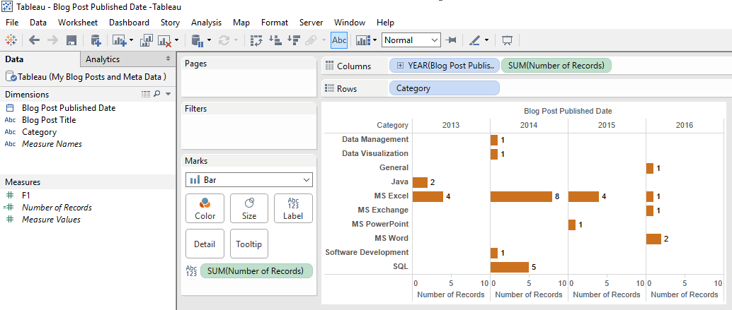 Dimensions: Are discrete categorical fields, in this case, fields such as Category and Year. Dimensions are fields that we want to slice and dice numerical data by. In the dashboard above, I have dragged and dropped two dimensions (i.e. Category and Year) from the left hand panel to the “Columns” and “Rows” shelves in the top middle of the screen. These dimensions, color coded in blue, create labels in the chart. Measures: Are continuous metrics -- numbers that we want to analyze and categorize. The metrics are color coded green (i.e. SUM(Number of Records)). The difference between a Dimension and a measure is that Dimensions do not change when we change the chart type or when new data is inputted, however; measures change based on the inputted data and they are visualized in different ways based on the type of chart we choose. To further illustrate, let’s change the chart type. I will do so by going to the “Show Me” panel and selecting a different chart type, 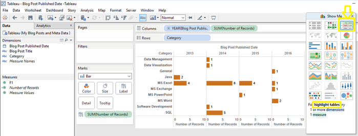 I have selected “highlighted tables” for this example. And here is the output in Tableau. 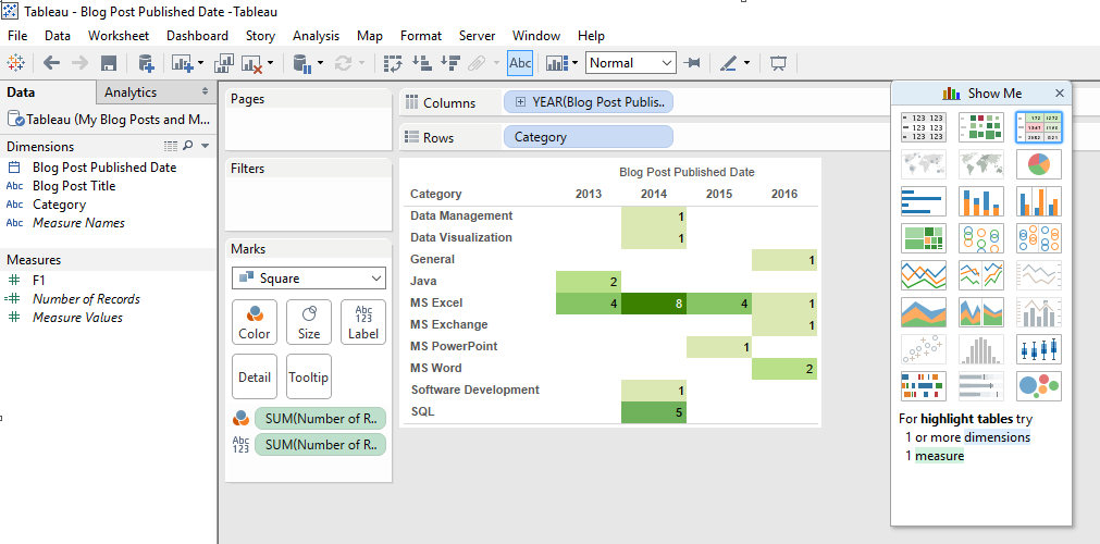
0 Comments
Your comment will be posted after it is approved.
Leave a Reply. |
